How to use WebPageTest's Graph Page Data view
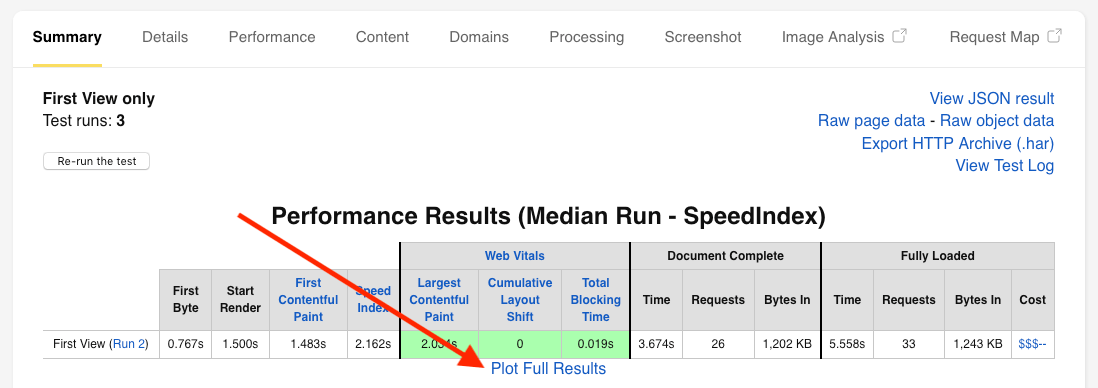
WebPageTest is a mysterious beast. You can use it almost every day for years and every so often a link catches your eye that you’ve never noticed before. It then leads you to a whole new set of functionality that you didn’t know it had. It’s happened so often I’ve actually written a whole section about the ‘hidden gems’ in my ‘How to read a WebPageTest waterfall chart blog post. In this blog post I’m going to focus on one of those ‘hidden gems’: the ‘Plot Full Results’ link that sits under the performance results on the ‘Summary’ tab. Unsure what I’m talking about? See the image below:
Clicking on this link will bring you to a page with a number of options and graphs available to you. It may be a little confusing as to what you are seeing at first, but let’s go through it together.
Context
First let’s cover what this page is doing, as there isn’t much on the page to really explain it. This page view exists to give you an overview of all the test runs that WebPageTest ran for the site you are testing. WebPageTest will pick the results from the median test run for either the ‘SpeedIndex’ or ‘Load Time’ metrics. By default it will use ‘SpeedIndex’ to choose the median run.
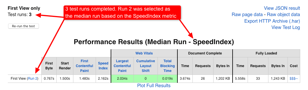
In the image above the data being shown in the table is from ‘Run 2’ of 3. The reason for multiple runs is because loading the same page under what seems like the same conditions, often returns wildly different results. This is the non-deterministic nature of the web. Variations in network traffic between the test agent and the website being tested (as well as many other factors) creates these variations in the end result. In order to reach a result that accurately represents the actual performance of a website at the given time, WebPageTest runs multiple test runs. It then picks the test run slap bang in the middle for the chosen median metric as the representative run.
This is the reason why you should run as many test runs as possible when using WebPageTest. On the public instance of WebPageTest you are limited to a maximum of 9 test runs. But if you have a private instance you can run as many test runs as you like. Just remember to always pick an odd number of runs, since you are wanting WebPageTest to return the median run. An even number of tests has no median test run, since dividing the total number of runs (minus 1 for the median) by 2 will return a non-integer number. e.g. (8 runs - 1) / 2 = 3.5. How do you pick the 3.5th test run?
But what about if you are interested in the results from the other runs in the test, not just the one WebPageTest has chosen? Well this is where the graph_page_data.php page helps. It gives you information about important metrics reported across all test runs that completed.
The graphs
So I’m going to describe this in reverse compared to the actual page layout, as I think it’s easier to explain once you have an idea of what metrics are being plotted in the graphs. The complete list can be seen below:
- Web Vitals - First Contentful Paint (FCP)
- Web Vitals - Largest Contentful Paint (LCP)
- Web Vitals - Cumulative Layout Shift (CLS)
- Web Vitals - Total Blocking Time (TBT)
- Load Time (onload)
- Browser-reported Load Time (Navigation Timing onload)
- DOM Content Loaded (Navigation Timing)
- SpeedIndex
- Time to First Byte (TTFB)
- Base Page SSL Time
- Time to Start Render
- Time to Interactive
- Time to Visually Complete
- Last Visual Change
- Time to Title
- Fully Loaded
- Estimated RTT to Server
- Number of DOM Elements
- Connections
- Requests (Fully Loaded)
- Requests (onload)
- Bytes In (onload)
- Bytes In (Fully Loaded)
- Custom Metrics included below.
There are a total of 24 metrics tracked in total (at the time of writing).
Basic graph
Let’s focus on a basic graph and examine it:
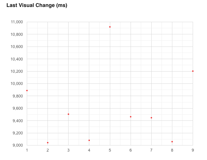
The graph is for the last visual change metric. Along the horizontal (x-axis) we see each of the 9 runs from our test. Up the vertical (y-axis) we see the time measured in milliseconds. The value from each test run for this metric is represented by a red dot on the graph. As you can see, there’s quite a variance for this metric over the 9 runs. The lowest being run number 2 at 9,043 ms. The highest, run number 5 at 10,920 ms.
But each graph comes with an associated table that extracts important statistical information about the metric across all runs.
Basic table
Below we see the table associated with the graph seen above. Last visual change metric over 9 runs.

Let’s go over each of the columns one by one:
Mean
This is the arithmetic (population) mean, or also commonly referred to as the average value of all the test runs for a selected metric. For this you add all the metric values together and divide by the total number of runs. It’s worth mentioning that the mean can be easily distorted if you have extreme variations higher or lower than the expected value (i.e. a high standard deviation).
Median
I touched on the median value a little earlier in the post. The median (or p50) is the value of the metric that falls right in the middle of the set of results. Each set is the total number of test run by WebPageTest.
p25
p25 stands for the 25th percentile. In web performance terms this is basically saying: “25% of users will have a score for this metric that is better than this value”. Users in this region are likely receiving a good overall experience.
p75
p75 stands for the 75th percentile. The same sentence as used with p25 works here: “75% of users will have a result for this metric that is better than this value”. By improving the performance of a metric at p75, you will be improving it for all users sitting at, or beyond it in the distribution curve (e.g. the low performing 25% long-tail users).
p75 - p25
In statistics this is known as the interquartile range, or IQR. This is giving us an idea of the difference between the 75th percentile and the 25th percentile. If this value is small we know the values for the metric are all fairly close to the median.
In our table we can see that if the last visual change metric value increases by 807 ms, it slips from the 25th percentile to the 75th percentile. IQR is a good measure of variation because it doesn’t take outliers into account. They are removed from the calculation since it is only focussing on the inner 50% of the data where most results will be clustered.
In terms of web performance we want to minimise this value. We want to pull p75 users up closer to p25 users so everyone receives a better experience.
StdDev
This stands for ‘standard deviation’, which is represented with the Greek letter σ (sigma) . It tells us how spread out our data set is from the mean. The standard deviation can be used to tell us if a result is statistically significant, or part of the expected variation. See the “68–95–99.7 rule” for more information on how standard deviation can be used to see if a result is expected, or an outlier.
A low standard deviation means the data is clustered close to the mean value. The data is much more predictable and the effect of variance is lower. We will see fewer outliers in the interquartile range. A high standard deviation tells us the data is dispersed over a wider range from the mean.
A lower standard deviation in a web performance context means the specific metric is more stable and predictable.
CV
CV stands for the Coefficient of Variation. This is the measurement of relative variability. It is simply the standard deviation divided by the mean, which produces a ratio. It is presented in the table as a percentage which is an optional, but sometimes more understandable step.
CV is essentially a normalisation process. It is useful when you want to directly compare sets of results that have different measures. E.g. If test A has a CV of 8%, and test B a CV of 15%, you would say test B has more variation than test A, relative to its mean.
In summary, all of the above values are giving us some insights into the spread and variance of the data from the test runs for a specific metric. For web performance, high variation is bad as it shows instability and less predictability for a metric.
Repeat view row
The ‘Repeat View’ row isn’t seen in the above image but there is an option to run and view the repeat view data. ‘First view’ data comes from a browser under ‘cold cache’ conditions. By that I mean all assets need to be downloaded, nothing is cached.
If you have ‘Repeat View’ selected there’d be a second row below with another set of results for when the browser loads with a ‘warm cache’ scenario. Comparing these two rows of data gives you some insight into the effect caching has on the metric being examined.
Configuration options
Now that we’ve gone over the basic graph and table for a specific metric, it’s a good time to look at the configuration options available to us at the top of the page:

Let’s examine these one by one.
View (First/Repeat)
Pretty self-explanatory really. Which results do you want to be plotted to the graphs? I’d say most of the time you always want the first view results plotted to see the metrics under ‘cold cache’ conditions. If you have run a repeat view, then you can enable this to see how the same metric changes under ‘warm cache’ conditions.
Median (Of plotted metric)
When selected, WebPageTest will draw a line on the graph through the run that has been selected as the median.
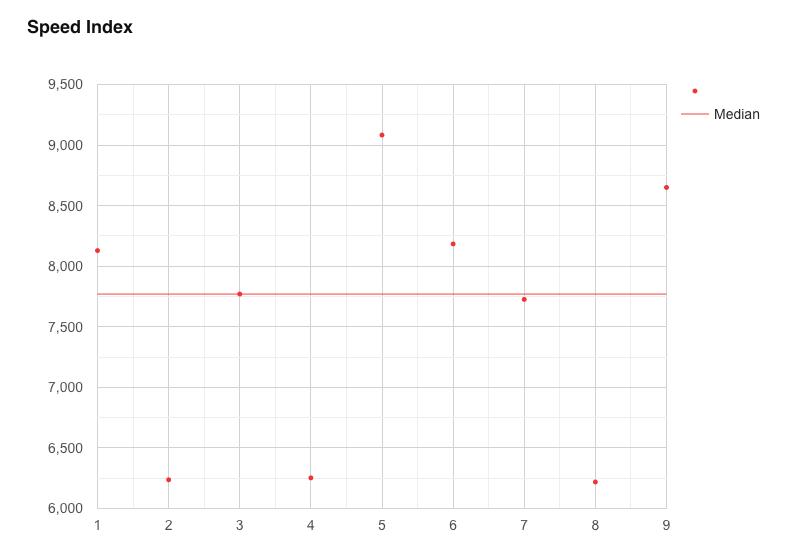
In the graph above for Speed Index we can see the median run that has been selected is from run number 3, and it has a value of approximately 7,750.
Median (Run with median metric SpeedIndex)
By default, the median run for the graphs is selected by examining the Load Time metric. The run that sits in the middle of all the runs is selected as the representative run for this test. But you can use another metric. Instead of looking at Load Time, we can tell WebPageTest to look at the SpeedIndex metric for the representative run.
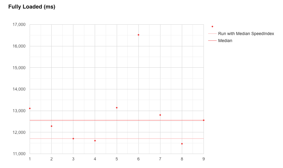
In the graph above we can see the difference that changing the median metric has on each metric. Two lines are now shown, one for when Load Time is used, the other for when SpeedIndex is used:
- Load Time: run 9 is selected which has a value of 12,558 ms
- SpeedIndex: run 3 is selected which has a value of 11,706 ms
This functionality is useful as it gives you a quick way to examine what the difference would be to all the metrics if you change the metric used to select the median run.
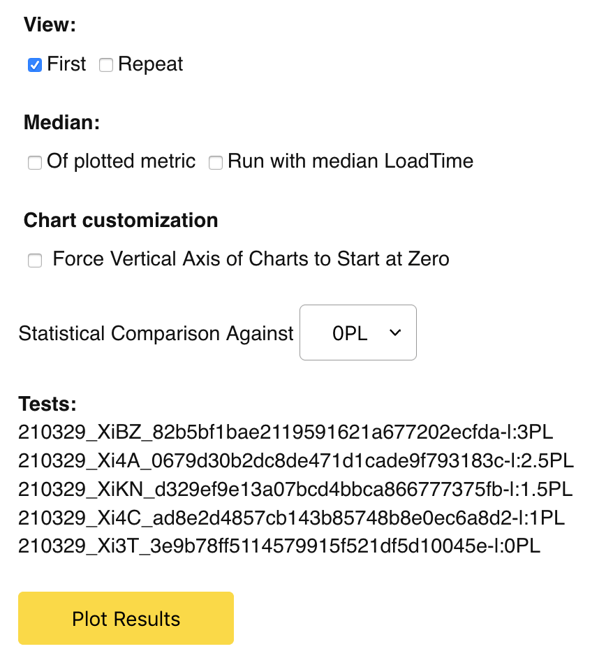
Statistical Comparison Against
So this is where it starts to get really interesting. It isn’t at all clear, but you can pass in multiple test ID’s into this page view, as well as associated human readable labels to make the graph keys easier to understand. This is done using the following URL pattern:
https://www.webpagetest.org/graph_page_data.php?tests=[TEST-ID-1]-l:[TEST-LABEL-1],[TEST-ID-2]-l:[TEST-LABEL-2],[TEST-ID-3]...
But don’t worry if that sounds too laborious I have a tool that I’ll show you later to make it easier.
What this functionality allows you to do is pass in multiple test ID’s and compare statistics against each other. So for example, say you are testing out a performance improvement and you are interested in seeing how this change has affected each metric at a statistical level. It allows you to do this.
In the dropdown you can select which test run you want to statistically compare all the other runs against. In the example below I’m testing loading a page with 0% packet loss against one with 3% packet loss.
Basic graph - Multiple test ID’s
Now that we’ve added another test ID, the graphs have changed:

Each graph now has two sets of points in different colours. We can now compare each set of test runs against each other. On the graph for the SpeedIndex metric we can see each median line has also been drawn:
- Zero % PL median - run 3 selected with a SpeedIndex of approximately 7,800 ms
- Three % PL median - run 4 selected with a SpeedIndex of approximately 11,000 ms
Now considering these two sets of tests are comparing the same page load under different packet loss conditions, it makes sense that the 3% packet loss has a slower SpeedIndex. But we can find more data to back this up.
Advanced Table
Once the ‘Statistical Comparison Against’ dropdown has been populated, a new table appears above each metrics graph. This table gives you a set of statistics that compares multiple sets of data for each metric:

You will notice that the bottom row has a set of blank cells. This is because it is the variant we are comparing all others against. First let’s set some context: We are comparing two populations of data, one with no packet loss, one with 3% packet loss. The question is:
Does this packet loss have an effect on the SpeedIndex metric, and if so, how likely is it that it just happened at random?
Let’s go through what each of the columns mean and see if there’s enough evidence to answer the question:
Variant
Pretty self explanatory, which set of data are we looking at in this row. By default the label you provide is used, if not then the test ID is used. Due to the length of a WPT test ID, it breaks the whole table UI and makes the table harder to read if you don’t add your own human readable label (-l).
Count
The number of test runs that were conducted during each test.
Mean +/- 95% Conf. Int
This is a confusing cell when you first look at it, but it actually contains 2 numbers. The first is the mean for the metric, the second is the value above and below the mean that covers the 95% confidence interval (CI). This is known as a normal based confidence interval. The 95% is saying that: ‘95% of the data for the test will sit between this range’. The true value for the mean if we had a larger sample size (by having more test runs), has a very high probability of sitting within this range. The probability of observing a value outside of this range is less than 0.05 (or 5%).
Translating this directly to the table we see above:
- 0% packet loss has a mean SpeedIndex of 7,583 ms, and the 95% confidence interval ranges from 6,744 ms to 8,422 ms
- 3% packet loss has a mean SpeedIndex of 11,041 ms, and the 95% confidence interval ranges from 8,894 ms to 13,188 ms
Diff of mean from [selected test]
What’s the difference between the means for each set of tests. In the table above we see that ‘Three PL’ has a mean value that is 3,457 ms higher than that of the 0% packet loss test.
p-value (2-tailed) P-value stands for percentage value. The p-value is the probability of obtaining test results at least as extreme as the results actually observed. 2-tailed means we consider values on both ends of the distribution curve (extremely high, or extremely low). The lower the p-value, the more meaningful the result because it is less likely to be caused by noise.
In the table above we see a probability of 0.006 (or 0.6%) is extremely low. So the likelihood of this result randomly occurring is very low.
Significant? Whether a result is considered significant depends on the p-value we set for significance before we start testing. In the case of WebPageTest, it uses the 95% confidence interval, this p-value is set at 0.05, or 5%. This corresponds to the 5% that sits “outside” our confidence interval. So there’s a 5% chance the results beyond the 95% confidence interval occurred at random.
In the above table the data has a p-value of 0.006, which means the results are significant, as the p-value is below 0.05 we set for significance. This is why the value in the table is ‘TRUE’ rather than ‘FALSE’.
Or to summarise all the above: the fact that the Speed Index metric for the 3% packet loss test has a much higher mean than the 0% packet loss data isn’t a random occurrence. It’s a significant result that we should pay attention too, and we can feel confident that it’s real. It isn’t a result that is likely to occur just from random variance.
WebPageTest Compare Tool
So I mentioned a tool to simplify URL generation. Well back in April 2020 I created a very basic tool for generating comparison URLs for WebPageTest which I blogged about here. The tool is available at https://wpt-compare.app/. Since writing this post you are reading now, I’ve added a new bit of functionality that will generate both the filmstrip URL (/video/compare.php) and the graph comparison page (/graph_page_data.php).
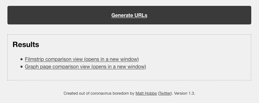
To use it simply enter the test URLs and then give each test a more readable label. Click ‘Generate URLs’ and follow the links provided.
Real-world example
So let’s take a look at a real world example and see what the data from the /graph_page_data.php page shows us. Here’s the test setup:
- URL: https://www.lenovo.com/gb/en/
- Comparing: Gzip vs Brotli compression
- Browser: Chrome Desktop
- Connection: 3G (1.6 Mbps/768 Kbps 300ms RTT)
- Test runs: 201
The reason for choosing this site is because it has a high number of assets compressed using either Gzip or Brotli compression. I counted 40 in total. I used the list that Paul Calvano posted on Twitter here to choose an appropriate website. 201 runs is a lot, so this was run on my own private WebPageTest instance (where there’s no limit on the number of runs you can complete). If you try the same, just be prepared to leave it running overnight!
Testing Brotli vs Gzip compression with WebPageTest is very easy. Just add the following script in the ‘Script’ tab when running the gzip test to force gzip compression:
addHeader accept-encoding: gzip,deflate
navigate %URL%
This adds a request header to all requests that overrides the browsers default. In doing so we are now essentially telling the server we only support gzip compression, so it doesn’t serve us brotli compressed files.
Update: Removing DNS lookup noise
After posting this blog post to Twitter I had a really useful conversation with Tim Vereecke and Andy Davies. Tim raised an excellent point that depending on DNS performance between the runs, this could be adding noise to the results. After all, the DNS performance is out of our control and really has no part to play in the results we are trying to examine. So if we could remove it then we’ll have a cleaner set of results. Thankfully this is entirely possible using WebPageTest scripting:
setDnsName www.lenovo.com www.lenovo.com
navigate %URL%
So what is this magic that is happening here? Thankfully Patrick Meenan was on hand to explain how this works:
setDnsName does lookups for the second param then stores them as overrides in the hosts file, effectively caching the DNS lookups locally.
But we can do better than this. That’s when Andy suggested a more generic (and flexible) version of the script:
setDnsName %host% %host%
navigate %url%
This does the same as the first script, only you are no longer hard-coding the URL’s. navigate %url% will take whatever URL you have added to the test URL input box and use it within the script.
I reran all 402 test runs to see what difference it made. And it really has made quite a difference to the results. So I’ve added a second version of the graphs to the metrics that were affected by this change.
A stable metric: SSL Time - with DNS lookup
First let’s take a look at a graph from a stable metric.

First thing to notice about the graph above is how grouped together the results are. Both the green and red median lines are pretty much on top of each other. And this is confirmed with the values for the means and the CI’s. Gzip’s CI is plus or minus 1.14 ms. So over 201 runs, 95% of the data is going to sit between 330.4 ms and 332.7 ms. That’s an incredibly small range. Brotli has slightly more variation, from 331.96 ms and 347.85 ms. With the p-value of 0.042, there’s a 4.2% chance of one of the run values sitting outside the 95% confidence interval. This is a significant result, that we can feel confident is real.
Overall we can see that Brotli vs Gzip compression has no performance impact on SSL time. Which of course when you think about it, it can’t. So I’m glad we now have graph data to back this up!
A stable metric: SSL Time - without DNS lookup
Since this test is examining only the SSL time in isolation, the DNS lookup time has no impact on this metric. The resulting graph was the same as above.
An unstable metric: TTFB - with DNS lookup
Let us now turn our attention to what looks like a much more unstable metric: the Time to First Byte results:

I’ll be completely upfront about this graph, I’m very surprised by it. From my understanding, I didn’t think compression would have an impact on TTFB at all, since I’m assuming all compressed asset versions were being cached by the CDN. But the graph shows a distinction between the two compression algorithms, with gzip having both a lower mean and median across 201 test runs. The p-value comes out as 0 (which may be an error due to rounding of significant figures, I’m unsure). Either way it is low compared to our 0.05 significance level set by the 95% confidence interval. So yes, this is a significant result that isn’t just from random variation.
I have a theory about why this could be. Brotli compression at levels 10 & 11 is incredibly resource intensive. So if for some reason this is happening “on-the-fly” each time, rather than being compressed and then cached, this could be causing the difference. It’s worth noting that Lenovo use Akamai’s Resource Optimizer to do this compression, so I’d guess this isn’t the case. But it’s the only explanation I have at the moment. Any other explanations or ideas please do let me know, I’d love to find out what is going on.
Here’s another point about the ‘graph page data’ view now worth mentioning: If it hadn’t of been for the statistical analysis seen here, this would have been missed. Now ultimately it may turn out to be a false positive that means nothing at all, but at least it is now visible and can be investigated further.
An unstable metric: TTFB - without DNS lookup
Let’s examine the difference DNS lookup time has on TTFB. Note: the y-axis scales are different so you can’t directly visually compare.

We are looking at a mean value of 214 ms reduction (1,632-1,417) in the mean time for gzip, and a huge 441 ms reduction (1,754-1,313) in the mean TTFB for brotli. This has given us a significant result now saying that TTFB is improved by using brotli in this instance, with a 104 ms improvement in the mean over gzip.
Obvious winners: Bytes in (onload and fully loaded) - with DNS lookup
Well as we are examining compression it’s probably a good idea to look at a metric where we’re pretty sure we’ll see improvements. The total number of bytes in:

In the above graph we see the number of bytes downloaded by the browser up to the onload event firing. As you can see, Brotli compression has saved 60 KB up to this point in the page load. The p-value is low, and the result is real since significant is set to ‘TRUE’.
Moving onto the fully loaded graph:

Here we see the total number of bytes downloaded by the browser during the page load. The graph shows 2 distinct strips of green and red, clearly showing the two compression methods in action. The stats show that 44 KB was saved with Brotli compression being used. P-value is 0 meaning it is therefore significant, so is a reliable result.
In both graphs above, what surprises me is that these graphs don’t just show a strip of green and red blobs across the graph. Some variance is actually shown. I have a couple of theories as to why this could be:
- The CDN is under CPU load so a different version of files is served to ease the bottleneck (e.g. a gzip version is served instead of brotli)
- Lenovo could have A/B testing in action on the homepage. Each bucket is slightly different meaning different assets are loaded
Again, it’s good that this graph view has exposed this peculiarity. If this were happening on my website I’d like to get to the bottom of why it is happening. With this data it’s now possible to investigate further.
Obvious winners: Bytes in (onload and fully loaded) - without DNS lookup
Since these graphs refer to the number of bytes downloaded by the browser, there aren’t affected by the DNS lookup time. They are the same as seen in the graphs seen above.
The unexpected: FCP and Start Render - with DNS lookup
And finally let’s look at a set of graphs that (for me) were quite unexpected, those related to First Contentful Paint (FCP) and start render:
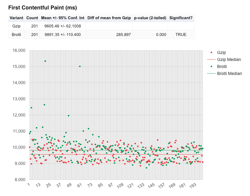
In the above FCP graph we see that the mean and the median for gzip compression is actually lower than brotli, meaning the gzip page is rendering slightly quicker than brotli. Again the p-value is 0, so the results look to be trustworthy.
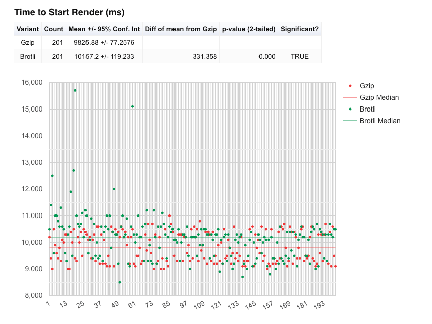
The same observation can be seen with the ‘Start Render’ which is actually totally expected given how start render is measured. So this just solidifies the FCP observation above. Brotli start render time is 330 ms slower than gzip at the mean. Again the p-value is 0, so the results look to be trustworthy.
So why could this be happening? Well it’s worth remembering that web performance is a problem space with many dimensions. Fewer bytes down the wire doesn’t always mean quicker. In this case it could be that brotli is slower to decompress on the device, so painting pixels to the screen is slower than gzip. Again this is another theory, but the data and analysis seem to suggest there’s a significant result here that shouldn’t be ignored.
The unexpected: FCP and Start Render - without DNS lookup
Let’s re-examine the FCP and start render metrics with DNS lookup time removed. Note: the y-axis scales are different so you can’t directly visually compare.
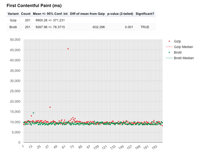
There’s been a huge change in the mean where brotli comes out a huge 632 ms quicker than gzip for FCP at the mean. Again another significant result with an incredibly low p-value of 0.001!
Moving onto start render:

Where we really see the difference is in the mean values. In this analysis brotli is 512 ms quicker for start render than with gzip, compared to 331 ms slower from the first set of results! Again the p-value is 0 meaning this is a significant result. DNS lookup time really does have an impact on performance.
User interface updates
While writing this blog post I raised a couple of issues and including feature requests for this page view:
- Fix the layout of the Statistical Comparison table.
- Allow multiple tables of data for graph_page_data.php when > 1 test ID
Compare metrics across multiple test IDs
Tim Kadlec kindly looked over these requests and added the ability to compare metrics like Mean, Median, StdDev etc across multiple test runs when more than 1 test ID is provided. So the new statistics tables look like below when passing in multiple test ID’s:
In the example above we are comparing the FCP times as various percentages of packet loss are introduced to the connection.
Force graphs y-axis to start at zero
In some cases where comparing across test runs the graph would start at a y-axis value that wasn’t 0. This can sometimes give the impression that the results are better than they actually are, because it amplifies the gains or losses seen. By forcing the y-axis back to 0 gives a more representative view of the data and the results. It is now possible to do this in the config options at the top of the page:
Many thanks to Tim for fixing the layout and adding these features.
Summary
In this blog post we’ve examined the seemingly invisible ‘Plot Full Results’ link that sits under the summary table on every WebPageTest result summary page. A link that you may have never even clicked on! We’ve examined what all the graphs and tables are and tried our hand at interpreting the results. On examining some real-world data we’ve pulled out a few unusual results that may have been hard to spot without this page view. We’ve also examined the difference that DNS performance can have on your test results. So consider removing this noise for your own testing in the future.
So next time you run a test using WebPageTest, why not click the ‘Plot Full Results’ link and see what it tells you. Thanks for reading.
Note: It’s been far too many years than I care to admit since I studied statistics, so there’s been a fair amount of ‘on-the-job’ learning happening while writing this post. So if you happen to spot anything that is totally wrong, or just poorly explained please do let me know and I’ll correct it and give you credit in the ‘post changelog’ below.
Post changelog:
- 13/04/21: Initial post published. Big thanks to Tom Natt for checking and feeding back on parts of this post during the draft stage.
- 16/04/21: Added new graphs to show the difference DNS performance can have on the results. Thanks to Tim Vereecke for the tip, and to Andy Davies for the script optimisation.
- 22/05/21: Added information about the UI updates from Tim Kadlec.
